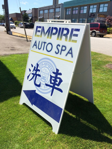
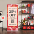
Despite how small and insignificant it may seem, having an effective outdoor sign will do wonders in generating profit for your business. An ideal sign should reflect your branding and its message while drawing customers in with just a glance. Here is a list of things that you should consider if you are interested in increasing your sign’s visibility and improving its legibility:

- Location
Place your sign close to the street – as much as regulations allow – and make sure that it stands out. In terms of its shape, size, and colour, the sign should be eye-catching, free of obstructions, and positioned at an appropriate height. You can even try driving past your business from all directions to find the best location. - Size
Aside from being easy to read and understand, your font should be big enough to be seen for people of all age groups. Rather than using all caps, use mixed-case letters, and make sure to have one inch of letter height for every 10 feet of viewing distance. - Colour Theory
Choose contrasting colours for your sign, such as black on yellow or dark blue on white, for example. However, make sure to also consider your brand’s colours and the responses that you want to receive on a physiological and psychological level. For example, hot colours or orange, yellow, and red are considered high-response colours, while blue, green, and purple are less stimulating. You need to have a sufficient amount of “white space” on your sign as well. In other words, 30% to 40% of your sign’s area should be completely bare. This will help prevent visual clutter, making the sign more readable. - Be Succinct
Did you know that the average adult reads about 250 words per minute? This indicates that you should be brief and straight to the point when adding information to your sign. First, think about what you want to say, and say it as briefly as possible. Next, edit your copy until the unnecessary words are gone, and the main idea remains. Aim for three to five words per headline, and provide supporting information, only if it is necessary. When it comes to abbreviations, studies have shown that they take 800 to 1,000 milliseconds to read. For that reason, it is best to avoid them, unless they are either universal or an important part of your message. - State the Benefit to the Customer
Ask yourself what your customer is buying the product for. After you have that figured out, incorporate it into your sign. For example, if they are buying a product to make their hair more manageable, tell your prospective buyer, “Manage curly hair with X!” - Use the Words “You” and “Yours”
You can make messages even stronger through adding two simple words: “you” or “your.” When customers are able to see themselves using your products, there is a higher chance that they will buy them. In addition, the words “I,” “me,” and “my” also give a similar personalizing effect. - Provide Context
Giving context always helps readers understand and react to the message more quickly. Through including audience-familiar words and phrases or using rhythm, rhymes, repetition, or alliteration, they will help in processing speed and memory. - Be Creative
In order to keep your sign from being boring, use humor and clever wordplay as an attention- grabber. That way, people will think you have a fun place to shop in. There are many customers who also appreciate jokes, and may even go as far as to take a picture of your sign and share it online, thus, giving you free publicity. - Create a Sense of Urgency
Since impulse buys make up for up to 55% of retail sales, you need to get people to act now. If there are any time-sensitive specials, people will stop to take a look, before pulling their wallet out. Help customers look for ways to save and give them the best shopping experience. - Sing Your own Praises
Do not hesitate to boast about your business. You can use customer testimonials, rave reviews, or even refer to any distinctions or awards you have won.
If you have signage that is able to captivate your customers, you will definitely notice more money coming into your business. To get the best outdoor signs possible, visit us at Minuteman Press Burnaby! We are a full service printer company that provides services, from conception and design, to a final completed product. We strive to provide the highest quality products in a timely fashion at competitive prices with friendly service. Other services that we offer include
printing stickers, banners, business cards, yard signs, sandwich boards, and more! Call us at 604-451-9185 for a free quote!

